Whew!
I’m on a roll, aren’t I?
Anyway, I’m not too sure what was exactly needed for this so I just went with what our master badge list said. So let’s get to it. First things first.
I really enjoy typography, I was surprised when I saw the differences between the first and the second website that the tutorial showed. There was a huge difference and the main difference was primarily the typography. It’s incredible, that kind of power.
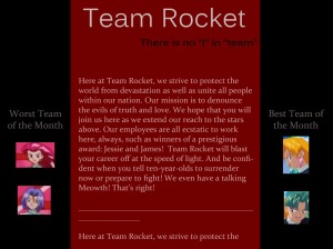
So I created a very rough mock-up for Team Rocket’s homepage (yes. Pokemon Team Rocket). I tried to keep in mind the design principles for both of them. The first one I did was fairly difficult to make it look at least a little better than a preteen’s cheap myspace:
The hardest part with this was the color scheme. At first the red was much brighter and it made the words very difficult to read. I tried to think of what the tutorial had said to do, but at first it escaped me how to keep the color scheme and the text. And then after playing around with it, I realized that instead of making the font darker and more black, I should make it lighter and more red. So that’s what I ended up doing for both lighter texts. They aren’t white, obviously, but they are a pink color. I think that reduced the “sparkle” a lot. I used the font Constantia for the text and then for the name I used Kalinga for the title and the subtitle. As I made this, I kept in mind what the woman said about readability.
Serif-fonts allow for easier readability, and the columns need to be a bit narrower. So I used serif fonts for the text and sans-serif fonts for the title. And when the font was still very difficult for me to read,, I was stuck as I had changed the color of the background, the text, and I had played with the fonts. The text just did not want to be read. But then I remembered another trick: Font size. One thing she said in the tutorial was to not be afraid of font size. So I made sure I wasn’t. I made the text big enough to be read, but not too big. I wanted it to be read. Not awkward.
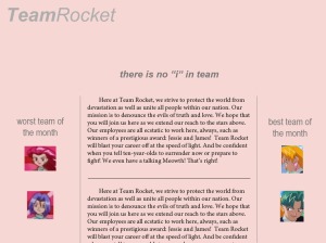
So once I put in a few little nods towards the Team Rocket I enjoy, I moved on to the next one. This one I wanted to go with a light feeling. A bit feminine almost, but I had fun with it. I wanted it to be softer, and so I went with a light red- which is unfortunately a little pink, but it works with the gray.
This time I tried for elegance. The text font is Minion Pro and the title is really just simply Arial. I had a hard time making it feel right. But I finally managed to make it something I was happy with when I put the two words together and bolded “Team”. Again, I played with the font size and made it bigger and smaller depending on what I was thinking. In the end, I really thought that though it’s used a lot- Arial was the best for this kind of site. It kept the overall look clean and simple. I went back and forth on capitalizing the letters in the titles of the different sections, and in the end I felt that any capital letters in the names would overwhelm the look.
Then it was the hard part. I was the most unsure about this: my term paper. I attached what I had done for it. I basically went through, looking at how I could improve it. And what I did was I again, used serif-fonts for the text (I went with Century) and sans-serif font for the titles (I went with Lucida Sans Unicode). I had to make the font size itself smaller for it to look stream-line and effective, so the font size is 11, and I changed the spacing between paragraphs to 1.5.
The numbers are Trebuchet Ms and I made the section titles all small caps with no capitalization otherwise. Things I kept in mind when going through was when the tutorial kept referring to fonts as “having character” and so I looked for this character in all the fonts I tried until I found one that matched the content of the essay. I also had to keep in mind that I’m working with italics a lot since my subject is a television show. So I needed a title and a body font that would reflect that.
In the end, I hope I did this badge right but I had fun no matter what. Fonts are highly entertaining.

